


Why Color is Your Most Immediate Tool For Crafting a Strong Brand Identity
Jul 26, 2017
The first thing people think of when they consider your brand is your company’s logo , and like it or not, every logo comes with a host of emotional associations that will shape how people relate to your company. Logos carry meaning, and if you want to ensure that your logo’s meaning accurately lines up with your brand, the most important place to start is color.
People process visual information up to 60,000 times faster than words, which means that major factors in forming preferences between competing brands occur within fractions of a second. Of all these factors, color is the strongest and most immediate influencer in the decision making process.
Nearly 85 percent of consumers cite color as the primary reason they choose a particular product, and 80 percent of people believe that the use of distinctive colors increases brand recognition.
What colors you choose for your brand will be among the most significant decisions you make in forming your brand identity, but that decision itself is anything but obvious. The meanings behind color are not cut and dry.
Color and Context
Colors do not hold fixed meanings, and indeed, they trigger very different associations in different contexts for different individuals.
Culture, age, and gender, among many other factors, can alter perceptions of any given color for any given situation, and within those groups, there will never be a true consensus. White may be worn by mourners in one culture, while in another culture, it may be worn for celebrations. Older generations may prefer subdued and conservative color palettes, while younger generations may be drawn to bright and fluorescent colors.
Know your audience first, and when reacting to color, try and learn as much as you can to put yourself in the place of your target demographic.
Getting it Right
When navigating such complex and fluid meanings, the guidance of a practiced eye is critical in ensuring the skillful use of color to reflect your brand’s tone, message, and values.
Good graphic designers are experts in coloring your logo to match your brand identity, as well as the product or services that it represents. Every startup entrepreneur should engage experienced designers who have a deep knowledge of the use of colors, but that doesn’t mean you should sit this decision out.
Great branding is the product of creative collaboration, where top-level expertise works with a company through every step of the process. The higher your personal baseline for understanding color is, the more effectively you’ll be able to inform the process, and make key decisions between proposals for communicating your brand vision.
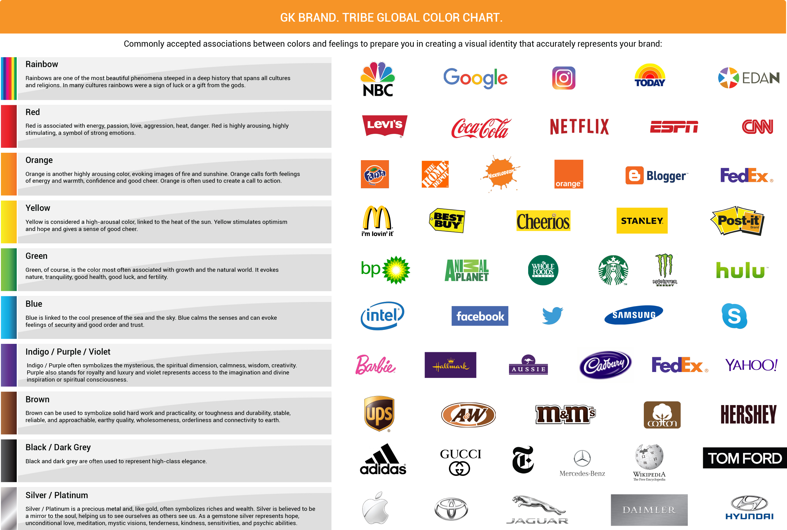
Here are a few commonly accepted associations between colors and feelings to prepare you for your collaboration with GK Brand Tribe Global in creating a visual identity that accurately represents your brand:
Rainbows are one of the most beautiful phenomena steeped in a deep history that spans all cultures and religions. In many cultures rainbows were a sign of luck or a gift from the gods.
Red is associated with energy, passion, love, aggression, heat, danger. Red is highly arousing, highly stimulating, a symbol of strong emotions.
Yellow is considered a high-arousal color, linked to the heat of the sun. Yellow stimulates optimism and hope and gives a sense of good cheer.
Blue is linked to the cool presence of the sea and the sky. Blue calms the senses and can evoke feelings of security and good order and trust.
Orange is another highly arousing color, evoking images of fire and sunshine. Orange calls forth feelings of energy and warmth, confidence and good cheer. Orange is often used to create a call to action.
Green, of course, is the color most often associated with growth and the natural world. It evokes nature, tranquility, good health, good luck, and fertility.
Purple often symbolizes the mysterious, the spiritual dimension, calmness, wisdom, creativity. Purple also stands for royalty and luxury.
Brown can be used to symbolize solid hard work and practicality, or toughness and durability.
Black and dark grey are often used to represent high-class elegance.
Silver / Platinum is a precious metal and, like gold, often symbolizes riches and wealth.
These examples are generalizations, but they are a helpful jumping off point for becoming more aware of color in the designs around you.
Of course, our connection to color is complex because in spite of differences across contexts, there are undoubtedly some universal aspects to how we relate to color, and yet those aspects are purely emotional and instinctual. In fact, there are whole spiritual traditions that have formed around understanding the essence and energy of color, if you want to explore what lessons ancient traditions may have to teach us about color and branding.
For the purposes of right now, however, see how you react on a gut level to color and how it shapes your view of popular brands as a potential consumer. Think of colors in the context of the following major brand logos, and pay attention to how they influence your relationship to.
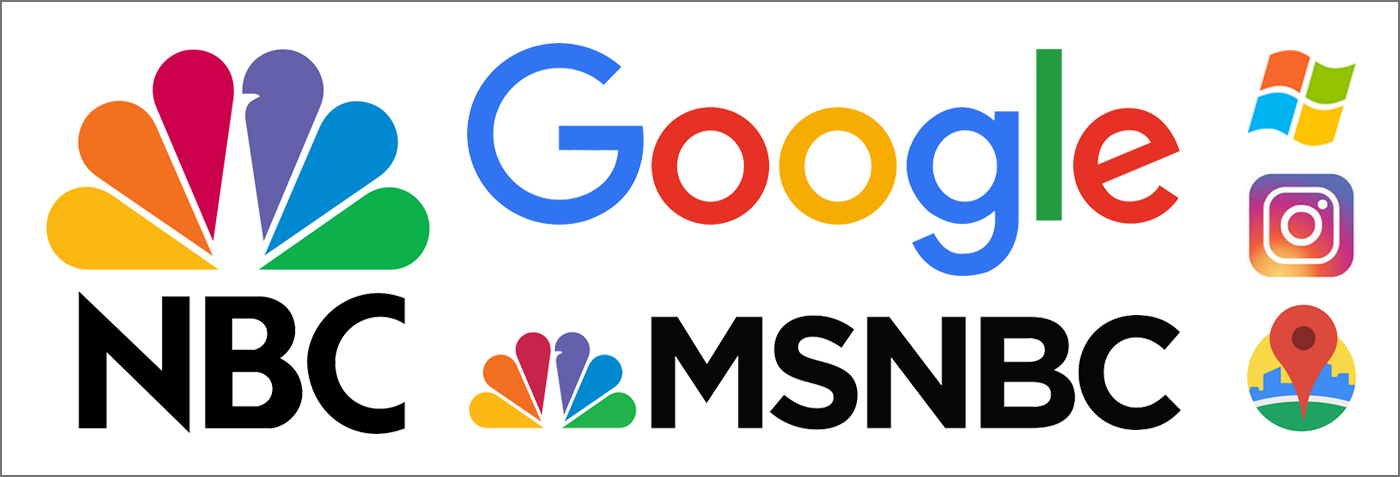
The modern and colorful peacock of NBC Network , was one of Vasken Kalayjian's first major rebranding projects at NBC, and is still in use today. Google uses similarly colorful approach for its brand.
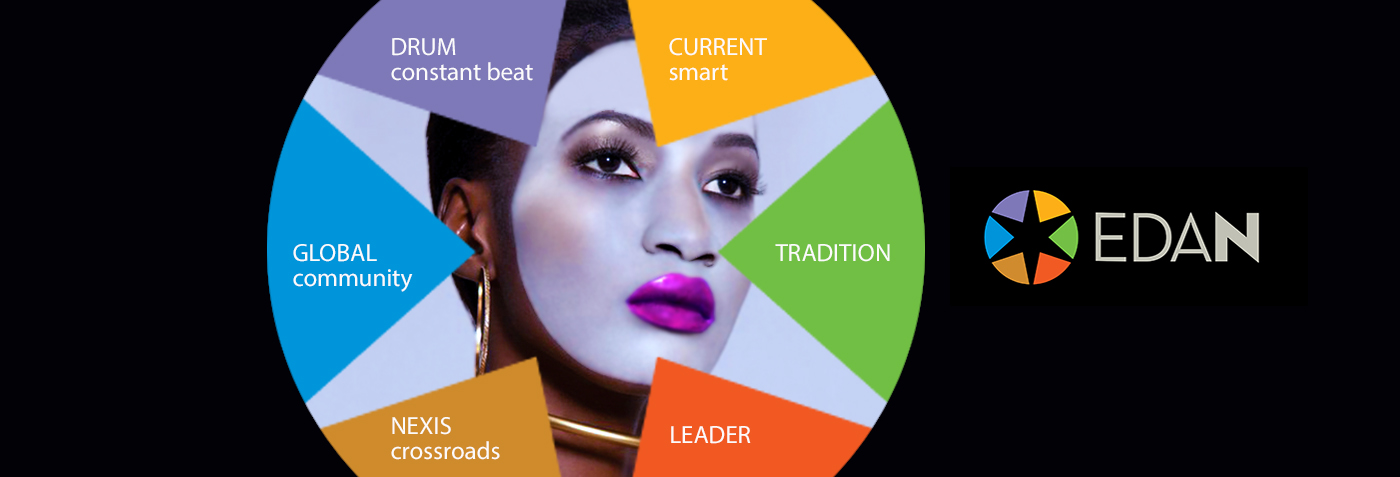
GK Brand created the EDAN Television Network brand which unites the very best of black culture on a single platform that is not only exciting and inspiring, but also a beacon connecting the world to an uplifting and self-confident global black identity. It is a strong and innovative new voice putting forth a positive and sophisticated image of black culture worldwide for a new generation to see.
Final Thoughts
In defining your brand, nothing influences first-impressions quite like brand color, and in fact, those impressions can have enduring consequences on how consumers relate to your company and its products.
Color is your most immediate tool for telling people something about who you are as an organization. It can be your greatest impediment or greatest advantage in forming a memorable bond with customers from a design perspective.
Start developing your sense for color sooner rather than later. It will help you maximize your collaborations with our branding specialists, and arrive at a visual identity that properly reflects your brand essence.
About the Author: Vasken Kalayjian is an accomplished Brand Strategist. Business Growth Specialist. Creating powerful brands that make an impact worldwide. GK Brand Tribe Global . Let's talk
#BrandIdentity #Color #Branding #Naming #CompanyNaming #CompanyBranding #NBC #EDAN #ChakraColors


